How to Format a Book for Submission and Sale
Let’s get one thing straight: you don’t have one manuscript format. You have three.
There’s the one you send to agents, a clean file designed for easy reading. Then there’s the one for print, which is all about the physical experience. And finally, there’s the ebook format, built for flexibility across a zillion different devices. Trying to use the same file for all three is a rookie mistake, and it’s a fast way to get rejected or earn a string of bad reviews.
Getting these three formats right isn’t just about making things look pretty. It’s about signaling that you’re a professional at every single stage of the game.
Why Flawless Book Formatting Is Non-Negotiable
For a working novelist, manuscript formatting isn’t some quirky aesthetic choice—it’s a gatekeeping mechanism. Pure and simple. Agents and editors are drowning in submissions, and they use formatting as a first-pass filter.
A manuscript that ignores industry standards screams amateur. It tells them, before they’ve even read a word, that the writing inside is probably just as undisciplined. It's a sign you haven't bothered to learn the rules of the professional world you're trying to break into.
Imagine being an acquisitions editor reviewing dozens of manuscripts a day. Standard formatting—double-spaced, 12pt Times New Roman, one-inch margins—is a godsend. It removes all friction and creates a predictable, clean reading experience, letting your story shine. When you deviate, you force them to work harder just to read your pages. They don’t have the time for that.
Beyond the Submission Pile
The stakes get even higher once you move past agents and into production, whether you’re going traditional or indie. The technical specs for print and digital books are completely different animals. Your single Word doc just won’t cut it for all three without some serious, targeted changes.
- Submission Format: This one is all about readability and hitting industry conventions. Its only job is to get your story read without giving an agent a headache.
- Print Format (Paperback/Hardcover): Here, you have to think like a book designer. Things like gutters, mirror margins, and trim sizes suddenly become critical for a book that feels balanced and professional in a reader’s hands.
- Ebook Format (EPUB/MOBI): This format is all about letting go. You have to surrender control and create a "reflowable" document that adapts to countless devices and user settings. Try to apply print formatting here, and you’ll just break the layout.
We’ve seen manuscripts where inconsistent chapter breaks in the original document created an ebook with a five-page chapter followed by one that was half a page. It absolutely kills the pacing and makes the author look careless—a disaster that proper formatting would have completely prevented.
The True Cost of a "Good Enough" Approach
This is where so many authors trip up, especially when juggling a complex series. That "one-size-fits-all" Word document is a recipe for pure chaos.
A small change in one version is easily forgotten in another, leading to brutal continuity errors between your ebook and print editions. You might fix a character’s name in the print PDF but forget to update the EPUB file you upload to Amazon. Readers will notice, and they will call you out on it.
This is why understanding how to format a book is less about memorizing software settings and more about adopting a professional workflow. It’s about building a clean, structured source document that you can reliably adapt for each specific purpose.
Get this right from the beginning, and you’ll save yourself countless hours of painful cleanup later. More importantly, you'll ensure your story is presented professionally, giving it the best possible chance to find its readers.
The Unbreakable Rules of Manuscript Submission Formatting
This part of the journey isn't about finding your unique artistic voice. It’s about professional courtesy. Pure, simple, and non-negotiable.
When an agent or editor opens your file, they want to find a story, not a design project. Every little deviation from the industry standard—a quirky font, single spacing, weird margins—is just another piece of friction. Another tiny reason for them to stop reading and move on to the next one in their slush pile.
These rules exist for one reason: to create a standardized, predictable reading experience. Your job is to make the formatting completely invisible so your words can shine. Getting this right signals that you understand the business of publishing and respect the reader's time.
The Core Layout
Think of these specs as the uniform you wear to a job interview. They aren't exciting, but they are absolutely required. Ignoring them is the fastest way to get your manuscript tossed aside before the first page is even finished.
Font: 12-point Times New Roman. That’s it. No exceptions. Not your favorite, Garamond, not the default, Cambria. Just Times New Roman. It's the industry workhorse because it’s legible and produces a predictable word count per page.
Margins: One-inch margins on all four sides. This gives the page breathing room and leaves space for the reader to make notes. It’s clean and professional.
Line Spacing: Double-spaced everywhere. This means the entire document, including dialogue and any block quotes. Single-spacing is an instant red flag. It’s a nightmare to read on a screen and leaves zero room for line edits.
Paragraphs: Set a first-line indent of 0.5 inches. Don't you dare use the tab key for this. Set it up properly in your word processor’s paragraph settings. And never, ever add an extra space between paragraphs. The indent already does the job of separating them.
These are the non-negotiables. Getting them wrong suggests you haven’t done the most basic homework.
An agent once told me they can spot an amateur manuscript from ten feet away just by the "color" of the page. A single-spaced, non-indented block of text looks dense and exhausting, signaling that the writer probably doesn't understand pacing or structure, either. It's a visual shortcut for "this is going to be work."
If you’re ever in doubt, just stick to the basics. Here’s a quick-reference table to keep you on the straight and narrow.
Manuscript Submission Formatting At a Glance
| Element | Specification | Reasoning |
|---|---|---|
| Font | 12-pt Times New Roman | Industry standard for readability and word count estimation. |
| Margins | 1-inch on all sides | Provides white space for readability and editor's notes. |
| Line Spacing | Double-spaced throughout | Eases on-screen reading and allows room for line edits. |
| Paragraphs | 0.5-inch first-line indent | Visually separates paragraphs without extra line breaks. |
| Alignment | Left-aligned, ragged right | Easier to read than justified text, which can create odd spacing. |
| Page Header | Last Name / TITLE / Page # | Ensures pages can be reordered if printed. |
| Scene Breaks | Single centered # | A clean, standard symbol that doesn't distract the reader. |
| Chapter Start | On a new page, 1/3 down | Creates a clear, consistent visual break between chapters. |
Master these, and you're already ahead of a huge chunk of the submission pile.
Structuring Your Document
Beyond the text itself, the structure of your document needs to follow a specific protocol. This isn't just about looking good; it's about clear navigation.
Your title page is the first impression. Keep it clean. It should only have the essentials: your legal name, contact info (email and phone), the manuscript title, your byline (if different), and the approximate word count, rounded to the nearest thousand. That’s it. No cover art. No fancy fonts. No loglines.
Then you have your page headers. Every single page after the title page needs a header in the top-right corner. It should contain your last name, the book’s title (or a shortened version), and the page number. For example: Smith / THE CLOCKWORK SPARROW / 1. This is critical. If someone prints your manuscript and drops the stack, this header is the only thing that lets them put it back together.
Handling Chapters and Scene Breaks
How you manage the flow of your story visually says a lot. Each new chapter must start on a new page, positioned roughly one-third of the way down. Your chapter heading can be simple, like "Chapter One," or include a title. Just be consistent.
For scene breaks within a chapter, the standard is a single, centered hash mark (#). Don’t use a row of asterisks, a fancy fleur-de-lis, or just an extra line break. A single, clean # does the job without yanking the reader out of the story.
These aren't arbitrary rules picked out of a hat; they're the shared language of the publishing world. Speaking it fluently from page one shows that you belong in the conversation. When you format your book this way, you remove every possible distraction between the agent and your story. You’re telling them you’re a professional, ready to work.
Formatting Your Book for Print Paperback and Hardcover
Switching from a submission manuscript to a print-ready file feels a lot like going from a blueprint to a load-bearing wall. The basic shape is there, but the physics have completely changed. This isn't just about making words look pretty on a page; it's about engineering a physical object that feels right in a reader's hands.
A print book is permanent. Unlike an ebook that can reflow text to fit any screen, every comma, margin, and line break in a physical book is locked in place. Your job is to make decisions that honor that permanence, creating a reading experience that’s so smooth it becomes invisible.
The Anatomy of a Professional Print Layout
The most jarring mistake in a self-formatted book usually isn’t the font choice—it’s the margins. A submission manuscript gets by with simple one-inch margins all around. A print book absolutely cannot.
Why? Because a physical book has a spine. The pages curve inward, and if you stick with standard margins, the text near the binding gets swallowed by that curve. The reader is forced to crack the spine just to make out the words, which is a terrible experience.
The fix is something called mirror margins. This feature, available in Word, Scrivener, and design software, creates asymmetrical margins where the inside margin (the gutter) is wider than the outside margin. It’s a small detail that makes a world of difference, ensuring no text gets lost in the binding. If you want to dive deeper into the differences between various writing tools, our comparison of Novelium vs. Scrivener offers insights into their layout capabilities.
A professional layout respects the gutter. An amateur layout ignores it. We’ve seen beautiful prose buried in a binding so tight that reading feels like a wrestling match. This is a technical failure, not a creative one, and it’s completely avoidable.
Another key concept is bleed. If your book includes any images or graphics that run all the way to the edge of the page, your file needs a bleed. This means the image must extend about 0.125 inches beyond the final trim size (the physical dimensions of your book). That tiny overlap gives the printer a margin for error, guaranteeing no accidental white slivers appear along the edge after the pages are trimmed.
Typography That Serves the Story
In print, font choice is all about legibility over long reading sessions. While your submission manuscript was probably locked into Times New Roman, you have more freedom here—but that freedom comes with responsibility.
For the body of your text, stick with classic serif fonts. Think Garamond, Caslon, or Baskerville. The little "feet" on serif characters are fantastic for guiding the eye smoothly across the page, which reduces reader fatigue. Sans-serif fonts (like Arial or Helvetica) work great for headings and titles, but they can be exhausting to read in long blocks of prose.
Also, pay close attention to your line spacing, or leading. It needs to feel comfortable, not cramped. A good rule of thumb is to set your leading to about 120-145% of the font size. So, for an 11pt font, that means a line height somewhere between 13pt and 16pt. The goal is to let the text breathe without creating distracting gaps between lines.
Structuring Front and Back Matter
The content before your story (front matter) and after it (back matter) follows a traditional order. You can customize it, of course, but straying too far from convention can feel jarring to the reader.
Here's a standard sequence for front matter:
- Half Title Page: Just the book's title.
- Title Page: Title, subtitle, author name, and publisher/imprint.
- Copyright Page: Copyright notice, ISBN, publisher info, and any disclaimers.
- Dedication: Your personal dedication.
- Epigraph: A relevant quote (optional).
- Table of Contents: Essential for non-fiction, but often helpful for fiction, too.
Your back matter might include things like an author's note, acknowledgments, a bio, or a sneak peek of your next book. The most important rule here is consistency—use the same fonts and styles as the main body to create a cohesive feel from cover to cover.
Getting this right isn't just cosmetic anymore; it's a discoverability issue. In the United States, print formats still make up a significant portion of trade publishing revenue. Readers expect a professional product, and a poorly formatted interior signals a lack of quality before they've read a single word. In a massive global market, nailing your print format is a financial necessity. Discover more insights about these publishing trends.
Give Your Ebook a Flawless Digital Experience

Let's get one thing straight: ebook formatting is an exercise in surrender. If you’ve spent any time with print design, you know it’s all about control—locking every word, margin, and image into a permanent, physical object. Ebooks are the exact opposite. You have to let go.
Your goal is to create a flexible, reflowable file that looks good on a dozen different devices, each with a dozen different user-selected fonts and text sizes. Thinking in "pages" is the first habit you have to break. There are no pages here, only a continuous flow of text.
Every print-based trick you’ve learned is now your enemy. Manual page breaks, using the tab key for indents, hitting enter twice for a scene break—these will absolutely shatter an ebook’s layout. Each of those actions embeds junk code that conversion software chokes on, leading to massive gaps, broken paragraphs, and a reading experience that screams amateur.
The Foundation of a Clean Ebook
The only way to create a clean, reliable ebook is to build it with a clean, structured document. Your word processor's "Styles" pane is your new best friend. Seriously.
Instead of manually bolding a chapter title and bumping up the font size, apply a "Heading 1" style. Instead of hitting the tab key at the start of every paragraph, modify your "Normal" or "Body Text" style to include a first-line indent. This isn't just about saving time; it's about embedding structural metadata that conversion software can actually understand.
When you export this file to an EPUB or MOBI, the software reads these style tags and translates them into clean HTML and CSS. A document built with styles converts predictably. A manually formatted document is a total lottery, and the odds are never in your favor.
A common disaster we see is a failed table of contents. If you don’t use proper heading styles for your chapter titles, the automated tools can't build a clickable ToC. Your reader is left with a file they can't navigate, which is one of the top reasons for returns and one-star reviews on Amazon.
This discipline pays off, especially as you grow. A manuscript built on styles can be reliably converted for different markets and devices, which is critical for global distribution. As indie publishing expands and authors seek wider audiences, a clean source file that meets various retailers' requirements is no longer a luxury, it's a necessity. You can dig into the numbers yourself with these global book sales statistics and market reports.
Handling Images and Special Elements
Images in ebooks are a balancing act. You need them sharp enough for a high-density screen but compressed enough to keep the file size from ballooning.
A good target is 150-300 DPI, saved as a JPEG. Always use your software's "Insert Picture" function—never copy and paste. And make sure to set the image to "In Line with Text" so it doesn’t float around unpredictably when the reader changes their font size.
For special elements like text messages, letters, or journal entries, create a dedicated paragraph style. Whatever you do, don't use a screenshot of the text. It's inaccessible to screen readers and becomes a pixelated mess when resized. A custom style, maybe with a monospaced font like Courier, keeps the text clean, readable, and reflowable.
You can also embed a specific font for things like chapter headings to keep your branding consistent. Just make sure you check the font's license first; not all of them are cleared for commercial ebook embedding.
Ultimately, your job is to create a master file that is both flexible and robust. For novelists who need absolute confidence that their final product looks professional everywhere, exploring different types of novel writing software can reveal tools with powerful, reliable export features built for this exact purpose. The less manual formatting you do, the cleaner your ebook will be, and the happier your readers will be.
Building a Repeatable Formatting Workflow
The real secret to formatting a book isn’t mastering a piece of software; it’s building a system that keeps you from redoing work. This is what separates the pros who ship clean files on deadline from the writers stuck in an endless loop of cleanup and correction. It’s about making smart, structural choices early so you aren't fixing tiny errors across 300 pages at the last minute.
Your workflow should always move from structure to content, then to final output—never the other way around. I’ve seen so many writers try to format as they draft, a process that’s both messy and destructive. The goal is to create a pristine source document first, one where the underlying structure is sound, before you even think about the final PDF or EPUB.
Choose Your Weapon Wisely
The writing software you use will absolutely shape your workflow. Each tool has its own quirks and strengths, and knowing how to exploit them is the key to getting this done without pulling your hair out.
Microsoft Word: It’s the industry standard for a reason, but only if you use it correctly. Its power is hidden in the Styles pane. You have to build your manuscript using styles for everything: body text, headings, block quotes. Manually formatting each chapter heading is a direct path to a broken table of contents and a nightmarish ebook conversion. Trust me on this.
Scrivener: This one is built for output flexibility. Scrivener’s magic is its Compile function, which lets you spit out multiple formats (submission .docx, print PDF, EPUB) from a single project file. The trick is to meticulously set up your Section Types and Layouts within Compile. This is where you map your manuscript's structure to the specific formatting demands of each output, ensuring total consistency.
Google Docs: Think of it as a collaboration tool first. Its formatting controls aren't as granular as Word’s or Scrivener’s, but its live collaboration is a godsend when working with editors. The key here is to enforce a strict styles discipline during editing, then export a clean .docx file to finalize in a more powerful tool before creating print or ebook files.
No matter your choice, the core principle is the same: use styles to define structure. For a deeper look at your options, we've broken down some of the top choices in our guide to the best writing software available today.
The Pre-Formatting Gut Check
Here’s the step most authors skip, and it costs them dearly. Before you lock in your final print margins or compile your EPUB, you have to make sure the content itself is consistent. Formatting a manuscript with continuity errors is like painting a house with a cracked foundation. It looks fine for a minute, then it all falls apart.
This is precisely where running your manuscript through Novelium saves you from those soul-crushing re-formatting cycles. By analyzing your draft for plot holes, timeline slips, and character contradictions before the final layout, you catch the errors that would otherwise force you to tear apart a perfectly formatted file. Correcting a character's eye color in Chapter 28 of a print-ready PDF is an absolute nightmare. Finding it beforehand is just a simple text edit.
The most effective formatting serves the reader's immersion. When the layout is invisible, the story takes center stage. But even the most elegant typography can't save a manuscript where a character knows something on Tuesday that they don’t learn until Friday.
This isn’t just about aesthetics. Readers expect a professional experience in both print and digital formats. Bad formatting—like inconsistent scene breaks that kill the pacing or a broken layout that makes a story unreadable—leads to bad reviews and lost sales. Tools that connect content analysis to your formatting workflow help you create a final product that supports the story, rather than getting in its way. You can find more details in this breakdown of publishing industry statistics.
Common Formatting Questions from Professional Authors
Even after you’ve formatted a dozen books, there are always those tricky, specific questions that pop up. The ones that send you down a rabbit hole of forums and contradictory advice. Let’s cut through the noise and tackle the questions that seem to trip up even the most seasoned authors.
The whole process boils down to a simple, three-stage workflow: Structure, Analyze, and Finalize. Sticking to this order keeps things clean.
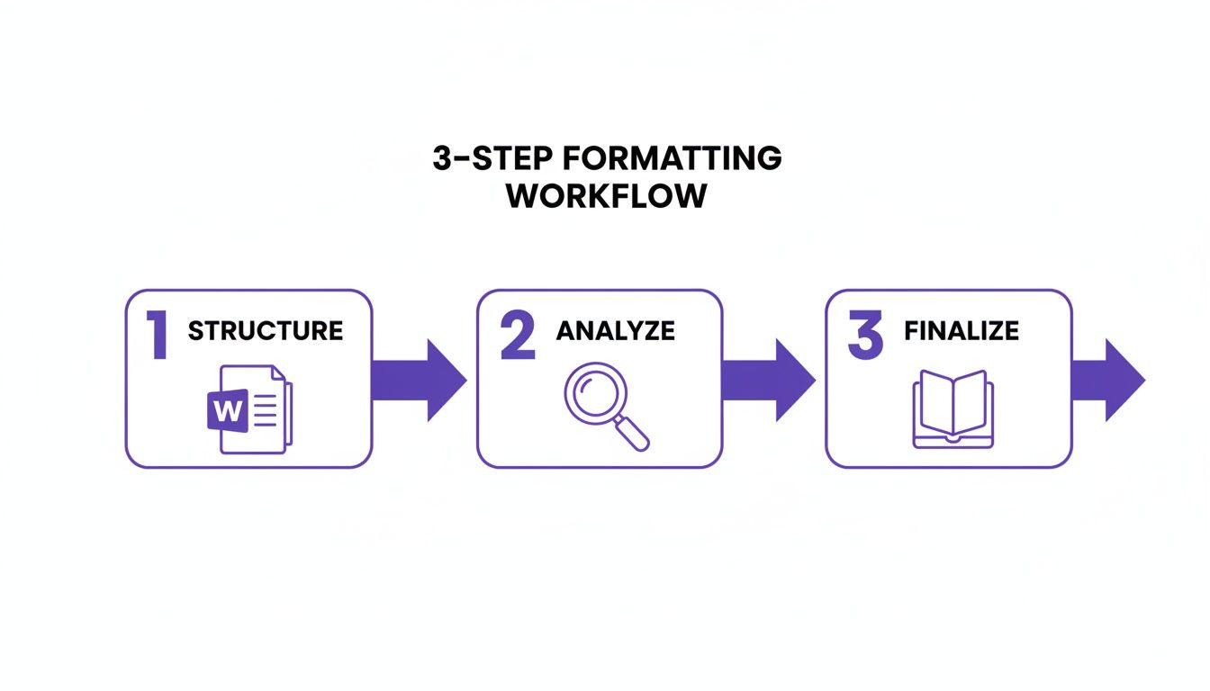
This workflow is crucial because it forces you to analyze the content before you lock in the layout, which will save you from a world of hurt and costly mistakes down the line.
What Is the Best Font for a Fiction Book?
For submissions to agents or publishers, there is only one right answer: 12pt Times New Roman. Seriously, don't get creative here. Just give them what they expect.
For your final print book, you have more freedom, but the classics are classics for a reason. Serif fonts like Garamond, Caslon, or Baskerville are industry standards because they're exceptionally easy on the eyes during a long reading session.
With eBooks, it's a different game. The best move is usually to let the reader’s device settings do the heavy lifting. You can embed a specific font for chapter headings to keep your branding consistent, but forcing a body font often leads to ugly compatibility issues. If you absolutely must specify one, stick to web-safe options.
How Should I Format Text Messages or Letters?
Consistency. That's the whole ballgame. For submissions, keep it simple: use block indents and italics to set the text apart. No need for complex formatting that might get stripped out anyway.
For your final print and eBook files, create a dedicated paragraph style (call it something obvious, like ‘Correspondence’). Give it a distinct look, maybe a monospaced font like Courier for text messages. Then, apply that style everywhere. Never, ever use images of text. They’re a nightmare for screen readers and don't reflow on digital devices, creating a broken, amateurish experience for your readers.
We once analyzed a manuscript where the author formatted letters inconsistently, making it impossible to tell which character was writing. It introduced a glaring continuity error that a simple, dedicated paragraph style would have easily prevented.
Can I Use Drop Caps in My Book?
Drop caps can give a print book that polished, professional touch, but they are notoriously finicky in eBooks. If you decide to use them, they absolutely must be generated through paragraph style settings—not by manually enlarging the first letter of a chapter.
Most professional design software like Adobe InDesign and some eBook conversion tools let you specify drop caps for chapter starts. But you have to test the final file on multiple devices and apps (Kindle, Apple Books, Kobo). Make sure they render correctly and don’t create weird overlaps with the rest of the text.
What Is the Difference Between a Hyphen, an En Dash, and an Em Dash?
Getting these three little marks right is one of those small details that immediately signals professional typesetting. Getting them wrong just screams amateur.
Here’s the breakdown:
- Hyphen (-): This little guy joins words together, like in ‘print-on-demand’.
- En Dash (–): Use this to show a range of values, like ‘pages 50–75’ or ‘the years 2020–2024’.
- Em Dash (—): This one marks a sharp, abrupt break in a sentence—like this very one.
Most word processors can be set up to create the correct dash for you as you type. Take a few minutes to learn the keyboard shortcuts or set up some autocorrect rules. It’s a tiny detail that makes a massive difference in the final polish of your book.
Formatting your book correctly is the final, crucial step to make sure your story reaches readers exactly as you intended. But even the most beautiful layout can't fix a broken story. Novelium analyzes your manuscript before you get to the formatting stage, catching the plot holes, timeline slips, and character contradictions that would otherwise force you to start the whole process over. Ensure your content is as flawless as your formatting. Learn more and try it for free at https://novelium.so.