Formatting for Kindle Direct Publishing: Quick Start to Perfect Book Formatting
Perfecting your formatting for Kindle Direct Publishing is the last, essential hurdle between your manuscript and a professional-looking book. This isn't just about making things look pretty; it’s about making sure the story you poured your heart into reaches your readers in a clean, navigable, and immersive way. Frankly, it's a non-negotiable part of finding commercial success.
Why Flawless KDP Formatting Is Non-Negotiable
Let’s get one thing straight: formatting isn't a tedious chore you rush through after the real work is done. It is part of the work. For any author serious about their career, it’s just as integral to the final product as a sharp plot twist or a compelling character arc.
Sloppy formatting screams amateur. It yanks readers out of the world you’ve built and costs you sales and good reviews.
At Novelium, we see firsthand how technical glitches can derail a story just as effectively as a plot hole. A missing chapter link, paragraphs bleeding together, or inconsistent scene breaks are digital tripwires for the reader. They remind people they're just reading a file—and a badly made one at that.
The Commercial Reality of Clean Formatting
When Amazon launched Kindle Direct Publishing (KDP) back in 2007, it blew the doors wide open for authors. Suddenly, anyone with a properly formatted digital file could sell their book globally. This shift helped create a self-publishing market valued at an eye-watering $10.2 billion in 2023, with projections showing it's only getting bigger.
In this crowded space, your book's interior formatting is one of the key signals that separates you from the noise. You can dig into more stats about the growth of self-publishing at meetglimpse.com.
A pristine file does more than just look good. It builds subconscious trust with the reader.
- Seamless navigation via a clickable Table of Contents shows you respect their time.
- Consistent typography creates a smooth, frictionless reading experience.
- Properly rendered elements like scene breaks maintain the story's intended pacing and rhythm.
To drive this point home, here’s a quick breakdown of what goes into a professionally formatted ebook and why it’s so critical.
Key Formatting Elements and Their Impact on Readers
| Formatting Element | Why It Matters for Pros | Impact of Poor Execution |
|---|---|---|
| Clickable Table of Contents | Allows readers to easily jump between chapters. It’s a basic sign of a professional product. | Frustrated readers who can't navigate. Looks amateurish and lazy. |
| Consistent Chapter Headings | Creates a predictable, clean structure. Reinforces author branding and series consistency. | A jarring, messy reading experience. Readers notice when things look “off.” |
| Clean Scene Breaks | Clearly signals a shift in time, place, or POV without interrupting the flow of the story. | Confuses readers about story transitions, breaking their immersion completely. |
| Properly Embedded Images | Ensures cover art and any interior images display correctly and at a high quality on all devices. | Pixelated, broken, or missing images that cheapen the entire book. |
| Standardized Typography | Uses a clean, readable font and consistent paragraph styling (indents, spacing) throughout. | Distracting font choices and messy paragraphs make the text hard to read. |
Getting these elements right shows that you care about the reader's experience just as much as you care about your story.
A reader who has to fight the format won't have the energy to fall in love with your story. They won't leave a five-star review, and they certainly won't buy the next book in your series.
Ultimately, great formatting is an investment in your author brand and your bottom line. It’s the final polish that ensures the presentation of your book lives up to the quality of the prose inside. It turns a great manuscript into a professional product ready to compete.
Choosing Your Source File: DOCX vs. EPUB
The first real fork in the road on your KDP journey is deciding what kind of file to upload. Do you go with a simple DOCX or a purpose-built EPUB? The path of least resistance, and the one many authors take, is to just upload a Word document and let KDP’s conversion process figure it out. For a straightforward novel without a lot of fancy interior design, this can work out just fine.
But let's be honest: trusting Amazon’s automatic converter is an act of faith. It’s a machine, and while it works well with a perfectly structured file, it can—and often does—make some very strange choices. We've seen it strip out custom scene breaks, completely mangle block quotes, and crush beautiful images into pixelated messes. When you upload a DOCX, you're giving Amazon permission to interpret your manuscript, and its interpretation might not line up with your vision.
The Case for Control with an EPUB
This is where the pros take a different path: creating an EPUB file before uploading. Think of an EPUB as a self-contained website for your book. It bundles everything—HTML, CSS for styling, images, and metadata—into a single, neat package. This format gives you meticulous, granular control over the final product. What you see in a validated EPUB is almost exactly what the reader will see on their Kindle.
This level of control isn't just a nice-to-have; it's essential if your book includes:
- Custom fonts for things like chapter titles or special sections.
- Ornate scene breaks or other graphical elements that are part of your book's feel.
- High-resolution images, like maps or illustrations.
- Complex layouts, such as text messages or handwritten letters woven into the prose.
A DOCX will fight you on these elements every step of the way. An EPUB, on the other hand, handles them with precision. Tools like Calibre, Vellum, or Atticus are designed specifically to generate clean, professional EPUBs. While some writing software can export directly to EPUB, the quality can be a mixed bag. It's why many authors separate the writing from the final production, a topic we touch on in our comparison of Novelium vs. Scrivener and other tools.
Choosing EPUB over DOCX is about shifting from, "I hope Amazon gets this right," to, "I am telling Amazon exactly how this should look." It’s the difference between being a passenger and being the pilot of your book’s presentation.
So, Which One Should You Use?
Here’s our unfiltered advice. If you're publishing a standard fiction novel—just prose, chapter breaks, and maybe a simple scene separator—and you've meticulously structured your manuscript with Word Styles, then uploading a DOCX is fast and usually good enough. Just make sure you check it thoroughly in the KDP previewer. If it looks good, you're done.
But for authors who are managing a series and need consistent branding, or for anyone crafting a book with even a hint of stylistic complexity, building an EPUB is the only way to guarantee a professional result. It definitely adds an extra step to your workflow, but it eliminates nearly all the guesswork and saves you from the horror of ugly conversion surprises. Taking the time to master EPUB creation pays for itself in quality control and, frankly, peace of mind.
Mastering Your Manuscript's Interior Structure
Alright, let’s dig into the guts of your manuscript. Once you've decided between a DOCX and an EPUB, the real work begins. This is where you separate the pros from the amateurs, because a clean, well-structured interior is the bedrock of a good reader experience on Kindle.
Forget about fancy fonts for a minute. The single most important job you have right now is to tell Amazon’s conversion machine what every single piece of text in your book is.
The only reliable way to do this is with Styles. Whether you're in Microsoft Word, Google Docs, or Scrivener, you absolutely must use the built-in style designations. Your chapter titles need to be "Heading 1." Your main prose needs to be "Normal" or "Body Text."
This isn’t a friendly suggestion. It's the command that lets KDP build a functional, clickable Table of Contents and keep your formatting from falling apart.
Manually bolding and centering a chapter title might look fine on your screen, but to the KDP converter, it's just another paragraph of text. This is the classic rookie mistake, and it always leads to a useless Table of Contents that will frustrate your readers right out of the book.
Getting the Front and Back Matter Right
Before a reader ever gets to Chapter 1, they have certain expectations. Your front matter isn't just filler; it's professional publishing protocol.
- Title Page: This is your first impression. It needs the book title, your subtitle (if you have one), and your author name. That’s it.
- Copyright Page: Right after the title page. This should have your copyright notice (e.g., Copyright © 2024 Your Name), a rights reservation (like "All rights reserved."), and your ISBN if you bought one.
- Dedication/Epigraph (Optional): If you've got one, it gets its own page after the copyright notice.
- Table of Contents: Don't build this yourself. KDP will generate it automatically, if you've used your Heading styles correctly.
Just as critical is how you separate these sections. You need to insert a hard page break at the end of the title page, the copyright page, and every single chapter. Please, do not just hit the "Enter" key a bunch of times to push text to the next page. A page break tells the e-reader "start a new screen here," which is essential for a clean, professional look.
This flowchart shows the basic journey from your word processor to a reader-ready ebook.
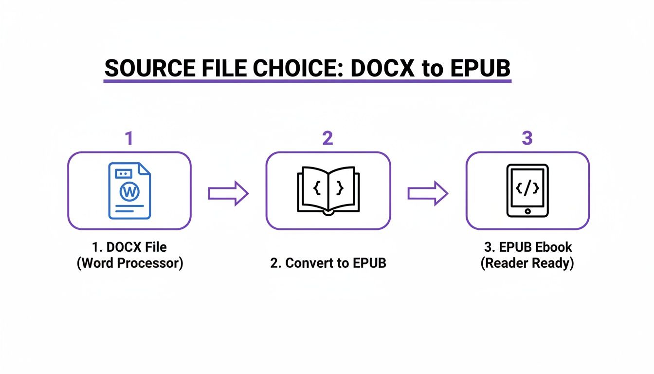
As you can see, both paths get you there. But building an EPUB with a tool like Calibre gives you far more control over the final look and feel of your book.
Scene Breaks and Text Flow That Don’t Break
How you show a break between scenes matters more than you’d think. The safest, most reliable method is to use a simple separator like three centered asterisks (***).
Some authors get creative with custom images for scene breaks. These can look amazing, but you really need to be building a proper EPUB to ensure they show up correctly on every device. If you're sticking with a simple DOCX upload, just use text symbols. It's foolproof.
The self-publishing boom has created a huge quality gap. On one side are the hastily formatted books; on the other are the professional-grade releases. In 2023, indie authors accounted for over half of Kindle’s Top 400, a figure that shot up 53% from the year before. At the same time, Amazon reported that over 2,000 indie authors have now crossed $100,000 in royalties. You don't hit that kind of success with sloppy formatting that leads to returns and bad reviews. For a deeper dive into these numbers, check out the analysis of self-publishing trends on philparker-fantasywriter.com.
Getting the interior structure right isn't about arbitrary rules. It's about building a stable, predictable reading experience that honors the story and respects the reader. A broken Table of Contents or a wall of text is the digital equivalent of a typo on the first page.
The Right Tools for Conversion and Validation
Once your manuscript is polished and properly structured, you’ve reached the final boss: converting it into a file that plays nice with Kindle. This is a notorious stumbling block for authors, but picking the right tool for the job can save you a world of hurt.
You really have three main paths, and each comes with its own set of trade-offs.
The simplest, most direct route is uploading your DOCX file straight to KDP. For a text-only novel with perfect styling, this can sometimes work just fine. It’s fast. But it also offers zero control. You’re basically tossing your manuscript into Amazon’s black box converter and praying it doesn’t spit out a mess of bizarre artifacts and formatting gremlins.
Kindle Create vs. Third-Party Power Tools
Amazon’s free Kindle Create software is a definite step up. It’s built to be user-friendly, letting you import your DOCX and then apply some Kindle-specific themes and flourishes. It gives you a bit more visual control and can produce a clean-looking file with minimal technical fuss.
The catch? It’s a big one. Kindle Create spits out a .kpf file, which locks you squarely into the Amazon ecosystem. You can’t take that file and upload it to Kobo, Apple Books, or anywhere else. For authors who plan to “go wide” and sell on multiple platforms, that’s an absolute deal-breaker. It's a walled garden, plain and simple.
If you want maximum control and flexibility, you need a third-party tool. The undisputed king here is Calibre. It’s powerful, it’s open-source, and it gives you god-tier authority over the final EPUB file. You can dig right into the underlying HTML and CSS to make sure every last element is perfect. This is the pro’s choice, especially for complex projects or for authors who just demand precision.
Yes, the learning curve can be steep. But the control it offers is second to none. Of course, the rabbit hole of conversion tools goes deep; our guide to the best writing software for authors touches on several other programs that have robust export options built-in.
The tool you choose is a strategic decision. Are you optimizing for speed, ease of use, or total control? There is no single right answer, only the best answer for your specific project and long-term publishing goals.
To help you decide, here's a quick breakdown of the main players:
KDP Conversion Tool Comparison
| Tool | Best For | Key Advantage | Main Drawback |
|---|---|---|---|
| Direct DOCX Upload | Authors in a hurry with very simple, text-only novels. | Fastest possible method; no extra software needed. | Zero control over the final output; high risk of formatting errors. |
| Kindle Create | Amazon-exclusive authors who want a simple, guided process. | Easy to use and creates a polished Kindle-specific look. | Locks you into Amazon's ecosystem with a proprietary .kpf file. |
| Calibre | Authors who want total control and plan to publish on multiple platforms. | Unmatched power to edit and perfect the EPUB file. | Steep learning curve; can feel like overkill for simple projects. |
Ultimately, the choice comes down to your publishing strategy. If you're all-in on Amazon, Kindle Create is a safe bet. If you value flexibility and control, it's worth taking the time to master a tool like Calibre.
Validation Is Not Optional
No matter which path you take, your final step before hitting publish is validation. This isn't just a suggestion; it's a critical, non-negotiable part of the process.
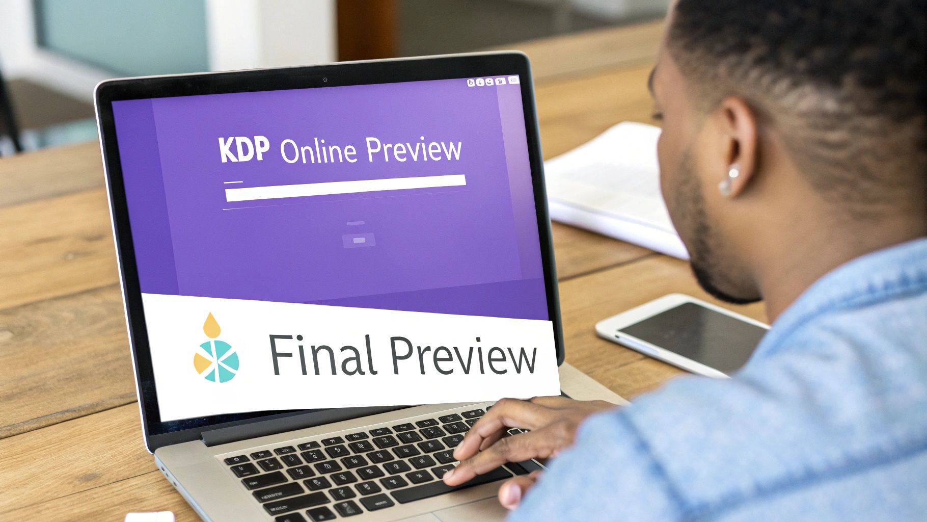
Use KDP’s own Online Previewer. Don't just give it a quick glance. Treat it like a diagnostic tool.
Click through every single chapter. Check every link in your Table of Contents. Most importantly, view your book on all the different simulated devices—tablet, phone, and e-reader. This is where you’ll spot the broken scene breaks, the mangled block quotes, and the images that looked great on your monitor but are an unreadable smudge on a Kindle Paperwhite.
Catching these errors here prevents them from becoming one-star reviews later. Consider this your last line of defense before your book goes out into the world.
Navigating the KDP Upload and Preview Process
You did it. You’ve wrestled your manuscript into shape, converted it, and now you’re standing at the final gate: the KDP dashboard. This last part of the race isn’t about creativity; it’s about a cold, hard, clinical check. Mess this up, and all your hard work can get derailed by one of those dreaded one-star reviews complaining about “technical issues.”
The process itself feels simple enough. You’ll head to your Bookshelf, start a new title, and click through the three main tabs—Kindle eBook Details, Kindle eBook Content, and Kindle eBook Pricing. While the Details tab is where you’ll put your metadata (title, author, keywords), the Content tab is where the rubber meets the road. It’s the final exam for your formatting.
Here’s where you upload your manuscript file—whether it’s a DOCX, EPUB, or KPF—along with your cover. Quick note on the cover: KDP wants a JPEG or TIFF file, ideally 2,560 x 1,600 pixels. Don't cut corners on this. Your cover is your book’s front door, and it needs to look fantastic.
Using the KDP Online Previewer Like a Pro
After your files are uploaded and processed, you'll see a shiny "Launch Previewer" button. Resist the urge to give it a quick glance and move on. This tool is your last line of defense against reader rage. You need to approach it with the same eagle eye as a final proofread.
The Online Previewer shows you how your book will look across a range of devices. The trick is to check every single one. What looks pristine on a tablet might be a jumbled mess on a smartphone.
Think of the previewer as a critical quality assurance step, not a formality. Rushing through it is like skipping the last round of edits. The mistakes you miss here are the ones your readers will find—and they won't be as forgiving as you are.
Your mission, should you choose to accept it, is to actively hunt for flaws. Click through your entire book, page by painful page. You’re looking for formatting consistency, clean images, and a working table of contents.
The Last-Chance Checklist Before You Publish
Before you hit that final approval button, do one last sweep. We've seen every single one of these issues sink an otherwise solid launch.
- Test Every TOC Link: Seriously, click every single chapter link in your Table of Contents. A dead link is an instant red flag that screams "amateur hour" and is a fast track to reader complaints.
- Verify All Scene Breaks: Scroll through the whole book. Are your scene breaks showing up as you intended? Or did the conversion process turn your elegant asterisks into a random character, or worse, make them disappear entirely?
- Check Image and Map Readability: How does that gorgeous, detailed fantasy map look on the phone preview? If it's an unreadable smudge, you’ve got a problem. You might need to simplify it or even add a link to a high-res version on your website.
- Inspect Special Formatting: Pay close attention to anything unique. Are your block quotes properly indented? Do the text messages or diary entries look distinct from your main prose? These little details matter.
- Confirm Front and Back Matter: Double-check your title page, copyright notice, and any links in your author bio or "Also By" section. A broken link to your mailing list is a lost reader.
This final, almost obsessive, check is what separates the professionals from the hopefuls. When you finally click that “Publish Your Kindle eBook” button, you want to do it with the confidence that your book’s presentation is as polished as your writing.
Your Burning KDP Formatting Questions, Answered
After you’ve published a few books, you start to see the same questions pop up again and again. They’re the little gremlins in the machine, the nagging details that can trip up even a seasoned author right before hitting "publish."
Let's put the big three to rest with some straight, no-nonsense answers.
What’s the Absolute Best Font for My Kindle Ebook?
This is a trick question. The answer is: it’s not your choice.
The reader decides.
Your one and only job is to create a clean manuscript using standard, default styles—think "Normal" for your body text and "Heading 1" for chapter titles. That's it. When you upload that clean file, Amazon’s conversion process creates a reflowable ebook. This lets your readers pick their favorite font, whether it's Bookerly, Caecilia, or something else entirely, right on their device.
Trying to force a specific, fancy font into your body text is one of the most common mistakes we see authors make. It’s a surefire way to create a frustrating reading experience, bloat your file size, and maybe even get your book flagged by KDP. Stop worrying about fonts and get obsessive about a clean, logical structure. That's what professional KDP formatting is really about.
How Should I Handle Maps or Images in My Book?
When it comes to pictures, maps, or any other kind of interior art, only two things really matter: resolution and placement.
You should always aim for a resolution of 300 DPI and save your images as JPEGs. This keeps them crisp without making your final ebook file gigantic. Critically, when you insert them into your manuscript, make sure they are set to "In Line with Text." This simple setting prevents the KDP converter from getting creative and randomly floating your image to a completely different page, a classic source of formatting headaches.
And be ruthless when evaluating complex maps. What looks breathtaking on your 27-inch monitor can easily become an unreadable, smudged-out mess on a tiny e-ink screen.
Always, always, always use the KDP Previewer to see how your images look on the smallest, phone-sized device. If you can't read it, neither can your readers—and they will mention it in the reviews. A great workaround is to offer a high-resolution version on your author website for free.
Should I Just Hire Someone to Format My Book?
This really comes down to a simple trade-off between your time, your technical confidence, and how complex your book is.
If you’ve written a straightforward novel with no interior images, learning to do it yourself is an invaluable skill. Getting comfortable with styles in Word or Google Docs gives you total control over your files. It'll save you a ton of money in the long run, especially if you plan on writing a series.
But if your book is packed with images, has special formatting for things like text messages or letters, or you just want to guarantee a perfect result without losing your mind for a week, then hiring an experienced formatter is a smart move. Just do your homework first: look at their portfolio and make sure they have a track record of formatting for KDP's latest requirements.
The real secret to a smooth launch isn't just clean formatting—it's having a story that's air-tight before you even get to that stage. Novelium is built to automatically find and help you fix the plot holes, timeline tangles, and character inconsistencies that can sneak into any manuscript. It ensures your story is as solid as your formatting.
Discover how Novelium can bulletproof your manuscript at https://novelium.so