Book Layout Design for Complex Fiction
Most advice about book layout design starts with fonts, chapter ornaments, and whether the title page feels elegant. That's backwards. For a long novel, the interior is a mechanical system. It has to move a reader's eyes across hundreds of pages, survive binding, preserve hierarchy through chapter breaks, and remain convincing when a retailer shows a sample on a phone.
A handsome file can still be badly engineered. Tight gutters swallow words, long lines make return sweeps unreliable, inconsistent baselines create visual drift, and a single continuity error discovered after export can force the whole production file back onto the bench. Novelists working with 80,000-word manuscripts, recurring casts, and complicated timelines need an interior that behaves predictably, not one that merely looks impressive in a screenshot.
Why Layout is an Engineering Problem
The popular assumption is that layout is visual styling applied after the actual work is finished. That assumption fails on long fiction. A novel's interior controls the physical conditions under which the reader decodes every sentence, and small errors repeat across the entire object. Repetition turns minor friction into fatigue.
Book design has always been tied to production constraints. The development of lowercase letters around the 9th century created a more efficient visual system for reading, while Gutenberg's movable-type press in the 15th century, commonly marked in historical accounts by 1442, made repeatable page composition possible at scale. Later, John Baskerville around 1750 and Giambatista Bodoni around 1800 refined type, paper, and letterform contrast. These weren't decorative episodes. They addressed the same problem modern formatters face: how to make text legible, reproducible, and navigable within the limits of physical manufacture. This history of typographic style shows why today's conventions descend from engineering decisions, not arbitrary taste.
Practical rule: Treat the interior as a reading machine. Every margin, line break, baseline, and chapter opening has a job.
A novel also has narrative mechanics that typography must respect. A chapter opener needs enough visual authority to signal a reset. A scene break needs to remain visible without making a short section look stranded. Running heads, folios, and paragraph indents must guide the reader without competing with the prose. The design succeeds when the reader doesn't notice the machinery, because nothing catches the eye for the wrong reason.
Setting Margins and Trim Sizes for Print
Print layout begins with the finished object, not the manuscript window on your monitor. The trim size determines the page's final dimensions, while bleed and binding determine how much working space exists before the printer cuts and folds the sheet.
A common trade-fiction format is 6 × 9 inches, but that finished size isn't always the document size you submit. Amazon's paperback guidance says pages are trimmed by 0.125 inches, or 3.2 mm, from the top, bottom, and outside edges. For a book with bleed, Amazon adds 0.125 inches to the width and 0.25 inches to the height, so a 6 × 9 inch trim becomes a 6.125 × 9.25 inch page size before trimming. Amazon's paperback bleed and trim guidance gives the production logic behind those figures.
Build the page from the spine outward
The gutter deserves more attention than almost any decorative decision. Binding consumes part of the inner edge, so the inner margin needs to be wider than the outer margin. A commonly cited trade-book setup uses roughly 0.75 to 0.9 inches for the inner margin, with outer, top, and bottom margins around 0.5 inches. TCK Publishing's book page layout guidance explains the practical consequence: text set too close to the spine disappears into the binding and becomes tiring to read.
For a 6 × 9 format, many mainstream layout guides place margins around 0.75 inches, with mirror margins allowing facing pages to operate as one spread. Don't set identical left and right margins and hope the printer will make the result feel balanced. On a bound book, the left page and right page have different physical relationships to the spine.
Use this production sequence:
- Set the trim size and confirm whether the interior contains bleed.
- Add the required bleed dimensions to the document size where appropriate.
- Create mirror margins, then make the gutter visibly larger than the fore-edge.
- Place the text block and inspect paired pages, not isolated pages.
- Print or preview representative spreads, including chapter openings and dense dialogue pages.
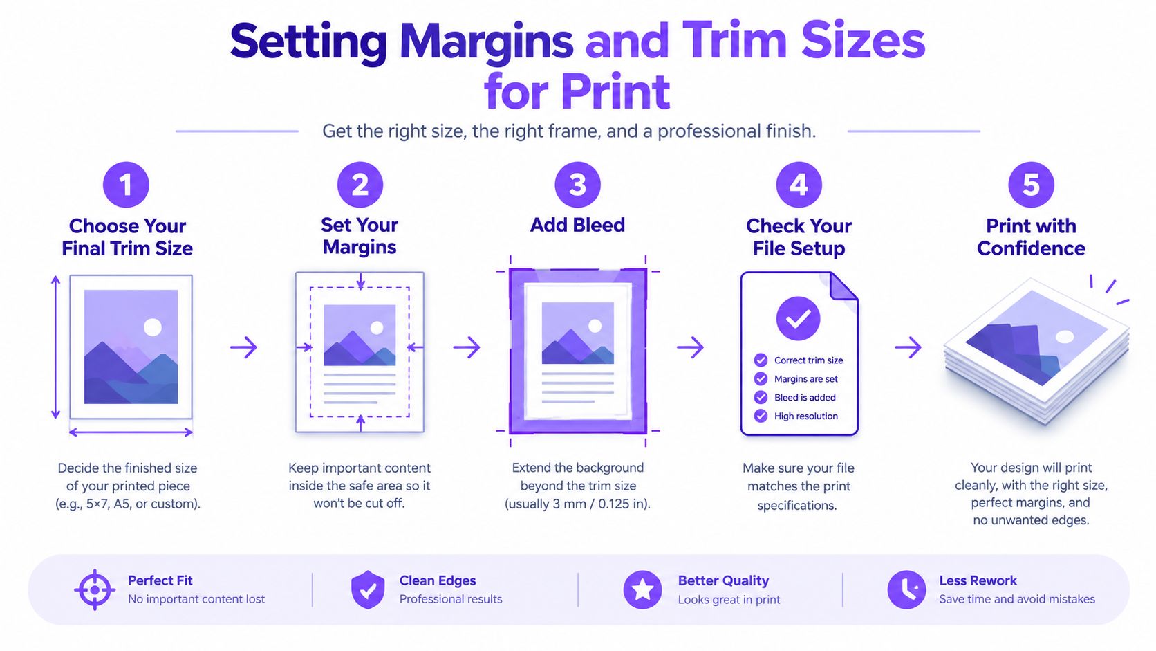
Bleed matters most when rules, illustrations, tint panels, or other elements run to the page edge. For image-heavy material, it's sensible to improve print production with AI upscaling before placing assets into the final file, but higher-resolution artwork won't rescue incorrect page geometry. The layout still has to account for trimming and binding.
A useful reference point is the print-on-demand glossary, especially when producing separate editions. Print-on-demand platforms may accept similar files while applying different specifications, so keep the production preset tied to the specific edition rather than treating one PDF as universally safe.
Tuning Typography for Long-Form Reading
Typography fails without fanfare. Readers rarely say, “The measure is too wide,” but they stop reading sooner, lose their place on return sweeps, or experience a page as denser than the prose deserves. In a fantasy novel with long descriptive passages, or a thriller switching among several points of view, those small interruptions accumulate.
The practical target for book-like body text is commonly 45 to 55 characters per line, while broader research reviews recommend staying below about 70 characters per line. The MIT typography lecture notes summarize research indicating that very short and very long lines can disrupt eye movement, while medium measures support reading speed and comprehension. Reader preference and reading performance don't always point to the same line length, which is why a formatter should test the page rather than worship a single rule.
Set the measure before the type size
Start by fixing the width of the text block. Then adjust type size, margins, and leading until the body copy sits comfortably within the target range. Don't begin by choosing a favorite font at a favorite size and force the page to accommodate it. That approach produces either oversized margins and an underfilled page, or a wide measure that makes the reader hunt for the next line.
Leading is part of the same system. Industry guidance commonly places it around 120% to 145% of the type size, or approximately 1.2 to 1.4 times the font size. Made Good Designs' book design principles connects that relationship to the reader's return sweep and page density. Longer lines need more breathing room, while cramped leading makes a page feel clogged.
An ERIC-cited study reports that two-point leading improved legibility by over five percent, and it stresses that longer lines require more leading. The same source notes that readers generally take in only three to four words per eye movement, which is why setting a long measure solid can become troublesome. The ERIC study on typography and legibility supports testing line length and leading together, not independently.
The common mistake is compressing both the measure and the leading. The page saves space, then charges the reader for it.
Check several page types, not one attractive sample. Test a paragraph-heavy page, a dialogue page, a chapter opening, a scene with italics, and a page containing a section break. For additional practical context, these handmade font legibility tips help separate a typeface's visual character from its actual reading performance. The Chicago Manual of Style glossary is useful when typographic choices intersect with broader publishing conventions.
Enforcing Baseline Grids and Fixing Defects
A professional interior has an underlying rhythm. Body-text lines should land on consistent horizontal positions across pages and spreads, even when headings, illustrations, or scene breaks interrupt the flow. A baseline grid enforces that rhythm and prevents the subtle page-to-page drift that makes a long novel feel mechanically loose.
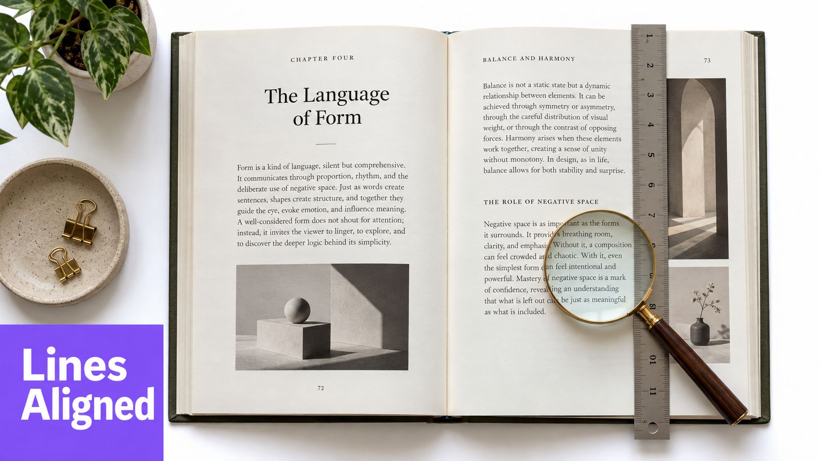
Set the grid from the body text, then make headings and display elements align to it where the design permits. Chapter openers can break the ordinary flow, but the following body pages should return to the established rhythm. If every section invents its own vertical spacing, the book starts to look assembled rather than typeset.
Widows and orphans need separate treatment. A widow is a paragraph-ending line stranded at the top of a page or column. An orphan is a paragraph-opening line left alone at the bottom. This book layout glossary defines the distinction and describes the usual remedies.
Fix the defect with the least visible intervention:
- Adjust paragraph spacing slightly when the change won't disturb the spread.
- Rewrite or tighten a sentence if the line break exposes an awkward fragment.
- Apply tracking sparingly, only when a small adjustment prevents a conspicuous defect.
- Move a heading or scene break when the page's hierarchy is causing the problem.
Don't solve every widow by shrinking the entire document. That trades one local defect for hundreds of weaker pages. Review the affected spread at normal reading size, because a change that looks harmless at close zoom can create an obvious hole in the page texture.
The mechanical side of typesetting is easier to inspect when the rules stay visible during production.
A final pass should compare consecutive spreads, chapter starts, and pages with unusual elements. The aim isn't sterile sameness. It's controlled variation, where the exceptions look intentional because the underlying system is stable.
Designing Interiors for Digital Discoverability
Print may be the finished object, but digital preview is often the first reading environment. Retailer samples, ebook previews, and phone screens reduce a carefully designed spread to a small, shifting viewport. That changes what interior design has to accomplish. The opening pages must remain readable and persuasive when the reader sees them without the physical context of the cover and spine.
Recent trend coverage for 2026 claims that 89% of discovery happens through thumbnail-sized images, a projection and industry claim that is discussed in this 2026 book design trends article. The precise figure matters less here than the design pressure it describes. Discovery happens in compressed digital environments, so visual clutter has less room to hide.
Let the opening pages do real work
A chapter opener that looks elegant in print can become a large blank interval on a phone. Ornamental rules may turn muddy. Small running heads can become irrelevant noise. The solution isn't to flatten the interior into generic ebook formatting. It's to make hierarchy survive reduction.
Use clear chapter titles, dependable spacing, and a body typeface with enough distinction between regular, italic, and bold styles. Keep section breaks visible without relying on tiny ornaments. If the first sample pages contain an enormous title treatment followed by little readable prose, the preview gives the browser a weak reason to continue.
Fiction also depends on pacing cues. A short chapter should feel deliberately short, not accidentally underfilled. A scene break should register at a glance. A point-of-view shift should be clear from the page structure before the reader has to reconstruct it from context.
The retailer sample is part of the book's sales surface, but it still has to behave like a book.
Build separate print and digital editions when the reading environments demand it. A 6 × 9 print page may translate poorly to a narrow screen, while an ebook needs reflowable hierarchy rather than fixed coordinates. Check the opening chapters on multiple viewport sizes and inspect both the visual rhythm and the plain reading experience. A layout that only works at full-page scale isn't finished.
Locking the Manuscript Before Export
A clean interior can't repair a manuscript that contradicts itself. Before export, the text has to be stable not only in spelling and punctuation, but also in character knowledge, object locations, travel sequences, injuries, dates, and who was physically present in each scene.
Static character profiles fail because they describe a person without tracking their changing state. A profile may say that Mara has a scar, but it won't necessarily tell you whether the scar exists before the knife fight, whether another character has seen it, or whether Mara can plausibly recognize a secret discussed in a scene she missed. That's the difference between a development document and a tracking system.
For long fiction, consistency records need to evolve with the manuscript. A character's knowledge changes scene by scene. Relationships alter after events. A supposedly missing object moves from a drawer to a train compartment and then appears in someone's hand without an intervening action. These are the errors that survive ordinary proofreading because every individual sentence can look perfectly grammatical.
Use a manuscript glossary alongside the layout file, then check the final text against the tracked state rather than relying on memory. Novelium's Character Tracker and World Codex extract character details and world information across manuscripts, including traits, relationships, knowledge states, events, and object references. That makes it suitable for checking impossible sequences before a fixed export turns a continuity problem into a production problem.
The final gate should cover both systems:
- Narrative state: Verify that characters know only what they could know and that events occur in a possible sequence.
- Physical continuity: Check injuries, clothing, objects, locations, and travel transitions.
- Production structure: Confirm chapter order, running elements, page numbering, front matter, and edition-specific settings.
- Export behavior: Open the PDF or ebook output, not just the source file, and inspect representative pages again.
Once the manuscript and interior agree, lock the source version and export the required editions. Don't keep making casual prose changes inside a finished layout. That's how one harmless paragraph becomes a cascade of page breaks, widows, and mismatched references.
Novelium combines manuscript consistency tracking with book layout tools, including curated themes, typography controls, trim sizes, margins, running headers, page numbers, and export to PDF, EPUB, DOCX, and HTML. If you're preparing a complex novel for publication, visit Novelium to check the manuscript state and build an interior that remains coherent from the first scene to the final export.