Back of a Book: A Practical Guide for Working Novelists
Most advice about the back of a book starts with a checklist: add a synopsis, author bio, endorsements, barcode, and price. That advice is tidy and mostly useless. A back cover isn't a storage area for whatever didn't fit on the front. It's a conversion surface, and every line either moves a browser toward opening the book or gives them a reason to put it back.
The dust jacket helped create that commercial role. Earlier wrappers protected books, but publishers gradually turned them into promotional surfaces, adding illustrations and sales copy by the end of the nineteenth century. By around 1900, dust jackets had become part of a book's market presentation, and later collectors made the jacket, including its spine and back panel, materially important to first-edition value. A South Carolina library study even found that jacketed books circulated more than three times as often as non-jacketed books, a useful reminder that packaging changes discovery behavior, not just appearance (Book Riot's history of dust jackets).
The front cover earns attention. The back cover closes the argument. If your blurb reads like a plot summary and your design looks like an overfilled noticeboard, you've handed the sale to the book beside yours. Treat the panel as part of the product, not publishing housekeeping. The back matter glossary is useful for separating cover copy from material that belongs inside the book.
Why the Back of a Book Deserves More Respect
The back cover is not a plot-summary service. It is a buying surface. Its job is to make a reader want the experience of discovering what happens.
A synopsis answers a cataloging question. A back cover answers a buying question: why this book, for this reader, today? Those jobs require different writing. A plot recap can be accurate and polished yet completely inert. It lists events, follows chronology, and may explain away the tension that should pull someone toward the first page.
Trade publishers recognized this when the dust jacket became a sales panel carrying blurbs, author information, praise, and retail details. The practical lesson is narrower and more useful: the panel must make a promise, not deliver a summary. Packaging shapes whether readers notice a book, understand its appeal, and choose to investigate it.
The panel has one job
A shop browser scans quickly. A digital shopper sees a thumbnail, opens the product page, and decides whether the book deserves more attention. In either setting, the back cover must signal genre, promise, and credibility before interest fades.
Tune that promise to the intended reader. A thriller needs pressure and unanswered danger. A romance needs the emotional bargain. A history book needs a clear question and a reason this account matters. The copy should sell the read those readers came for, not recite every major turn.
Every line earns its place. The hook creates charge. The blurb establishes the emotional contract without resolving it. Endorsements offer proof when they carry recognizable authority. The bio explains why this author has a credible place in the conversation. Barcode and price information keep the physical product ready for retail. Material that belongs inside the book is covered by the back matter glossary, not by the sales copy.
Indie authors often spend months refining a manuscript, then treat the back cover as an afternoon's administrative task. That choice gives the sale to a competing title. An excellent book cannot convert readers who have not yet recognized its value.
The Anatomy of a Modern Back Cover
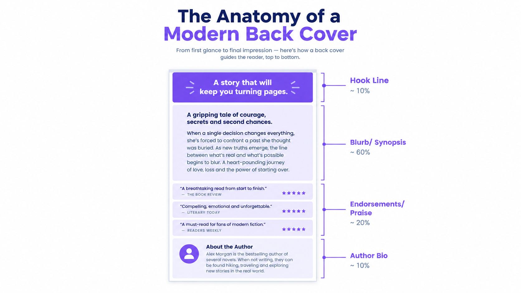
Readers don't inspect a back cover in publishing order. They scan it from the strongest visual signal downward, looking for confirmation that the book offers the kind of read they want.
Start with a hook line. This can be a sharp premise, a charged statement, or a short sentence that establishes atmosphere and danger. It shouldn't repeat the title or offer empty praise. “A sweeping story of love and loss” tells nobody what kind of book they're holding. A useful hook gives the blurb somewhere to begin.
The blurb follows. Keep its job in view: introduce the central situation, establish pressure, signal voice, and stop before the story's most valuable turns. A reader needs enough specificity to recognize the book's identity, not so much information that the narrative feels already consumed.
What earns space
Endorsements and praise lines can sit after the blurb or in narrow strips around it. Use them when they carry recognizable authority or make a precise promise. Generic applause creates visual noise.
The author bio usually belongs below the main copy, often beside or near the author photograph. It should establish relevant authority, appeal, or identity in a few useful lines. Don't turn it into a miniature autobiography. For fiction, the bio's purpose is trust and connection, not a complete career history.
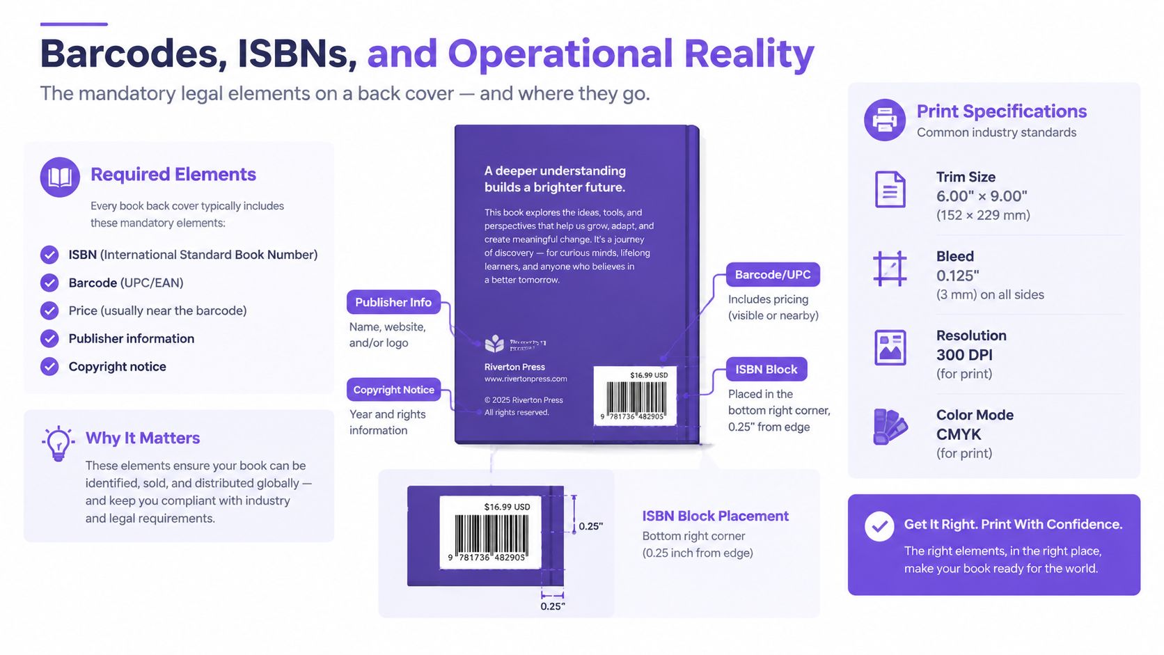
The lower portion carries the operational material. Retail barcodes generally sit in the lower area of the back cover, toward the right, on a flat, light-colored field. Placement guidance recommends keeping the symbol at least 0.25 in (6.35 mm) from the spine and trim, and 0.25 in above the bottom edge (Your Book Nest's barcode placement guidance). The ISBN, price, publisher or imprint logo, and any brief category line belong in this quieter zone. Mandatory retail information gets a clean home. Optional decoration doesn't get to crowd it.
Writing a Blurb That Sells the Read, Not the Plot
Most weak blurbs aren't badly written. They're aimed at the wrong target. The writer describes the sequence of events because the sequence is familiar to them, then mistakes information for persuasion.
A reader isn't buying a list of incidents. They're buying suspense, dread, intimacy, wit, wonder, erotic tension, moral unease, or the particular pleasure of watching a difficult mind collide with an impossible situation. Your blurb needs to sell that experience without pretending to deliver it in full.
A plot-heavy blurb usually has three faults. It starts with throat-clearing context, buries the hook under setup, and explains consequences that should remain active questions. It often sounds like a Wikipedia entry with better adjectives. The blurb glossary gives the term its practical meaning, but the craft decision is simpler: stop summarizing and start promising.
Change the question
Ask: what will the reader feel at page fifty that they can't feel right now? The answer points toward the copy's real material.
A thriller may promise escalating uncertainty and the pleasure of assembling evidence under pressure. A literary novel may promise close attention to a fractured consciousness, a family system, or a social contradiction. A romance may promise attraction complicated by a specific emotional obstacle and a satisfying movement toward intimacy. Speculative fiction may promise the shock of a changed order, but it must make that order legible quickly.
Name the protagonist when the name adds identity. Use active verbs. Put the central pressure near the beginning. End with an unresolved image, question, or decision that creates forward pull.
Practical rule: If the blurb can be shortened without losing the book's emotional promise, it wasn't selling the read yet.
Don't protect the manuscript by making the copy vague. “Secrets will be revealed” is not intrigue. Identify the kind of secret, the person endangered by it, or the cost of uncovering it. Specificity creates appetite. Spoilers kill it.
Matching the Blurb to Genre and Audience
Genre readers don't approach a back cover with a blank mind. They scan for signals that tell them whether the book understands the contract of its category. Your personal taste matters less here than reader recognition.
| Genre | Lead With | Avoid |
|---|---|---|
| Literary fiction | Interior stakes, thematic tension, and an evocative premise | Mechanical plot recaps and inflated claims about importance |
| Thriller or mystery | A high-concept threat, ticking clock, or question demanding an answer | Slow context before danger appears |
| Romance | Two named protagonists, relationship conflict, and emotional stakes | Hiding the pairing or obscuring the subgenre and heat level |
| Speculative fiction | A world hook or status quo about to rupture | Dumping invented terminology before the premise is clear |
Literary fiction can lead with consciousness, contradiction, or a pressure embedded in ordinary life. It doesn't need to imitate a thriller's machinery, but it does need movement. A beautiful premise without tension reads like jacket copy for a book that never starts.
Thrillers and mysteries should put danger, evidence, or an impossible question early. Readers want to know what threatens whom and why the answer matters. Romance copy needs the relationship visible almost immediately. Name both protagonists, establish the obstacle, and signal the emotional temperature without resorting to generic “will they or won't they” language.
Speculative fiction has less room for ceremonial worldbuilding than many writers think. Give the reader the changed condition, the destabilizing event, or the social rule that makes this world worth entering. Explain only the terminology needed to understand the stakes.
Sentence rhythm matters too. A literary blurb may use a slower, more textured cadence. A thriller needs propulsion. Romance needs chemistry and emotional clarity. Read the first two lines beside successful books in your exact subgenre, then audit your own for mismatch. Genre alignment isn't conformity. It's making the promise legible.
What Strong and Weak Blurbs Actually Look Like
Consider this weak opening:
Mara arrives in the coastal town after her mother's death. She finds a job at the hotel, meets Daniel, and discovers that the family has been hiding a secret connected to the old lighthouse.
Everything is understandable. Nothing pulls. The protagonist is passive, the hook arrives late, and “a secret” could belong to almost any novel.
A stronger version might read:
Mara came to the coast to bury her mother. The lighthouse keeper knows why her mother was afraid of the sea, and he won't be alive long enough to tell her twice.
The second version doesn't summarize more. It selects better. It gives the protagonist a reason to act, supplies a specific source of pressure, and ends on a threat that creates a question. The genre signal appears immediately through the setting, danger, and withheld explanation.
Read it like a designer
Weak blurbs commonly open with background, use passive constructions, leave the protagonist unnamed, and spend their strongest sentence explaining what the reader already understands. Strong blurbs put stakes first, use concrete nouns, and make every sentence earn its space.
Look for genre language in the opening thirty words, not buried near the end. A thriller needs threat or investigation. A romance needs the pairing and obstacle. A speculative novel needs the destabilized world. If the reader has to reach the final paragraph to identify the book's category, the copy has failed its first commercial task.
Rewrite the weak example by deleting the arrival, job, and discovery sequence. Keep Mara, the lighthouse, the dead mother, and the person who knows the truth. Then cut again. Your final line shouldn't resolve the tension. It should make the reader feel that opening the book is the fastest way to relieve it.
Barcodes, ISBNs, and the Operational Reality
A persuasive back cover can still fail at the till. A clipped barcode, crowded placement, or textured background turns a finished design into a production problem.
Retail guidance generally places the barcode in the lower-right area, on a flat, light section. Keep it clear of folds, trim, and the spine. KDP-style production guidance recommends a barcode around 2 × 1.2 in (50.8 × 30.5 mm), with a minimum around 1.4 × 0.8 in, printed black on white and left free of borders (Book Print Tools' barcode size guidance). Give those measurements to the designer as a production requirement, not as decoration. Contrast and surrounding space help scanners read the code.
Mark up the file before press
The ISBN identifies the edition. The barcode converts that identifier into a scannable retail object. Price, imprint, publisher mark, and any category line should stay readable without competing with the blurb.
Place the ISBN block in the quietest lower corner, confirm the clearance zone against the final trim, and inspect the print proof instead of trusting the screen. The ISBN glossary explains the identifier, while the author and designer remain responsible for checking the production file. Make the handoff explicit: location, dimensions, contrast, trim, and proof approval should all be confirmed before press.
The Case for Doing Less on the Back Cover
More praise does not create more proof. A crowded back cover makes readers sort through competing signals, especially when the book appears as a small storefront thumbnail or sits among other jackets on a busy table.
The strongest layouts work like a quiet salesperson. They present one hook, one clear stakes paragraph, credible proof, a compact bio, and enough open space for the barcode and the reader's eye. That restraint gives each element a job instead of making every claim fight for attention.
A back cover should be easy to understand before it becomes interesting to study.
Stacked pull quotes create a shouting match. Three typefaces make the panel look assembled rather than designed. Awards from publications the target reader does not recognize add bulk without authority. An author photograph that dominates the panel turns a novel into a personality profile, whether or not the author has earned that positioning.
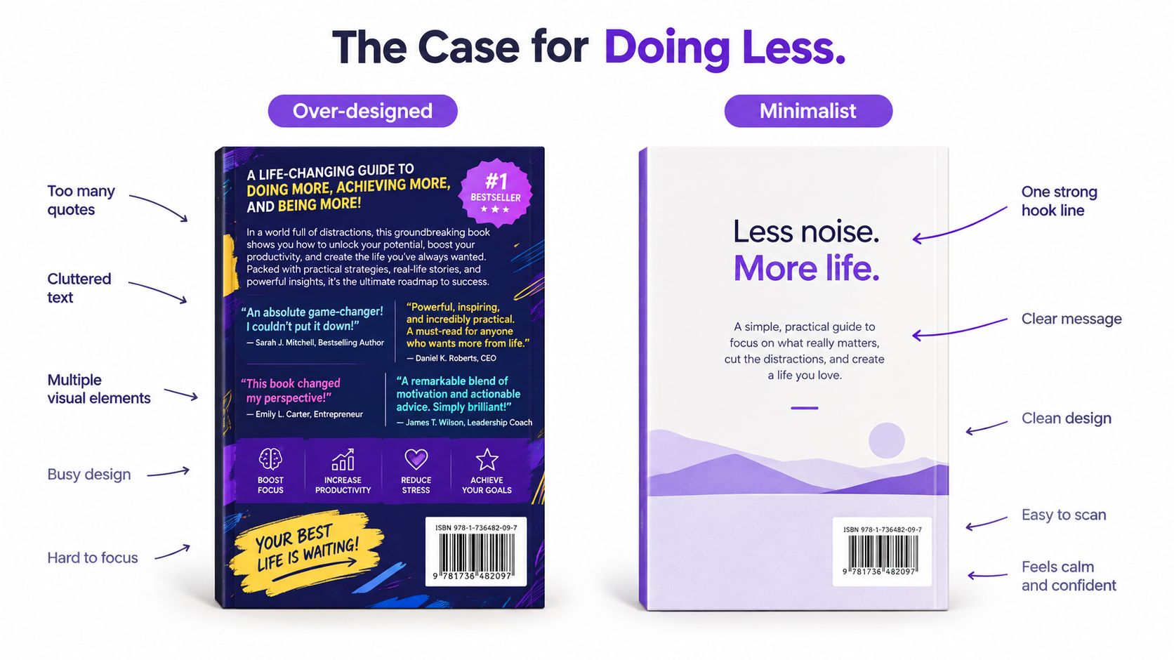
Use one test: can a reader identify genre, promise, and credibility in a glance? If not, remove an element. A QR code or digital extra earns its space only when it has a clear purpose and a one-line explanation. An unexplained square is clutter posing as strategy. Current design guidance also stresses small-scale readability and a limited number of high-signal elements (2026 book-cover design guidance).
A Short Pre-Launch Checklist
Use this as a final pass before the files go to the designer. Don't use it to postpone decisions that belong in positioning, editing, or packaging discussions.
Blurb readiness
Read the copy beside books in the exact shelf or storefront category. The opening line should lead with stakes, atmosphere, or the central promise, not the protagonist's childhood or a paragraph of setting history.
Check that the copy does four things cleanly:
- Genre fit: The first lines make the category recognizable.
- Stakes first: The protagonist faces a pressure the reader can understand immediately.
- Spoiler control: The copy creates questions without resolving the novel's best turns.
- Voice match: The rhythm and diction belong to this book, not to a generic publishing template.
Cut any sentence that only proves you know the plot. Your reader doesn't need an abbreviated synopsis. They need a reason to trust the experience.
Cover design fit
Shrink the full cover until the type is close to storefront-thumbnail size. If the hook, protagonist, or genre signal disappears, the design isn't finished. Use strong contrast, a coherent type system, and one font family unless the designer has a compelling reason to break that rule.
Author photography deserves the same discipline. A current, professionally lit portrait can support trust, but it shouldn't overpower the copy. For practical guidance on preparing a credible image, see these professional headshots for writers.
Operational details
Verify the ISBN and barcode against the edition being sold. Confirm the barcode's lower-right placement, its clear space from spine, trim, and bottom edge, and its contrast against the background. Check that the suggested retail price is legible and that the publisher or imprint logo sits outside the main reading path.
Final sales checks
Keep only endorsements that carry authority for this audience or make a specific promise about the read. Trim the author bio until every sentence earns its place. Confirm that the photo, praise, category line, and barcode remain inside the safe area and survive the print proof without clipping or awkward folds.
Novelium's Book Design & Formatting tool can sit alongside a final production pass, while its manuscript analysis tracks continuity issues that often undermine the copy's promises. Its Character Tracker and World Codex extract and track details across a manuscript, which is useful when a complex novel's back-cover claims depend on accurate character, setting, or event information. The tool is a check, not a substitute for editorial judgment.
The copyright page belongs inside the book, usually on the verso, or back left-hand side, of the title page, and standard front matter commonly places it on page 4 (HMD Publishing's copyright-page guide). Back matter follows the main text and can include author material, acknowledgments, appendices, notes, glossaries, bibliographies, indexes, or promotional pages such as “Also By” and a next-book excerpt (Jericho Writers' breakdown of book parts). Keep those functions separate from the back cover. A fiction novel's usual core setup includes a title page, copyright page, chapters, author bio, and an “also by” page, while forewords, bibliographies, and indexes are generally omitted unless the book needs them (Kindlepreneur's fiction book structure guide).
Novelium's Character Tracker and World Codex automatically extract and track character details across manuscripts, including traits, knowledge states, relationships, and events, so your back-cover promise doesn't contradict the novel underneath it. Visit Novelium to run a systematic continuity check across a complex manuscript before publication.